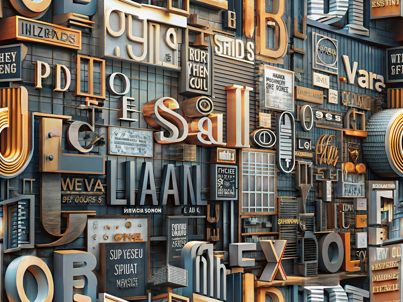
Typography That Speaks: Discover the 6 Best Fonts for Sign Readability
In the vibrant world of design, where every detail matters, the choice of font can make or break the effectiveness of a sign. Whether you’re crafting a bold storefront display or a subtle directional sign, the right typography ensures your message is not just seen, but understood. Let’s dive into the art of font selection and explore six fonts that promise maximum readability.
1. Helvetica: The Timeless Classic
When it comes to readability, Helvetica is the undisputed champion. Its clean lines and balanced spacing make it a favorite among designers. This sans-serif font is versatile, effortlessly adapting to various contexts, from corporate signage to creative displays. Helvetica’s simplicity ensures that your message is clear and direct, making it a staple in the world of typography.
2. Futura: The Modern Minimalist
Futura is the epitome of modern design. With its geometric shapes and sleek appearance, it captures attention without overwhelming the viewer. This font is perfect for signs that need to convey a sense of innovation and forward-thinking. Its readability is enhanced by its even spacing and clear letterforms, making it a go-to choice for contemporary signage.
3. Arial: The Reliable Workhorse
Arial might not be the most glamorous font, but its reliability is unmatched. Often considered the workhorse of the font world, Arial is straightforward and easy to read. Its no-nonsense design makes it ideal for signs that need to communicate essential information quickly and efficiently. Arial’s widespread use is a testament to its effectiveness in ensuring maximum readability.
4. Verdana: The Screen-Friendly Option
In an age where digital displays are ubiquitous, Verdana stands out as a font designed for screens. Its wide letter spacing and large x-height make it incredibly legible, even from a distance. Verdana’s clarity is perfect for digital signs and electronic displays, ensuring your message is accessible to everyone, regardless of the medium.
5. Gill Sans: The Elegant Choice
For those seeking a touch of elegance, Gill Sans offers a sophisticated alternative. Its humanist style and subtle curves give it a unique charm that sets it apart from more utilitarian fonts. Gill Sans is ideal for signs that need to convey a sense of class and refinement while maintaining readability. Its versatility makes it suitable for both formal and casual settings.
6. Impact: The Bold Statement
When you need to make a statement, Impact is the font to choose. Its thick strokes and condensed letterforms demand attention, making it perfect for headlines and attention-grabbing signs. While it may not be suitable for lengthy text, Impact’s boldness ensures that your message is impossible to ignore.
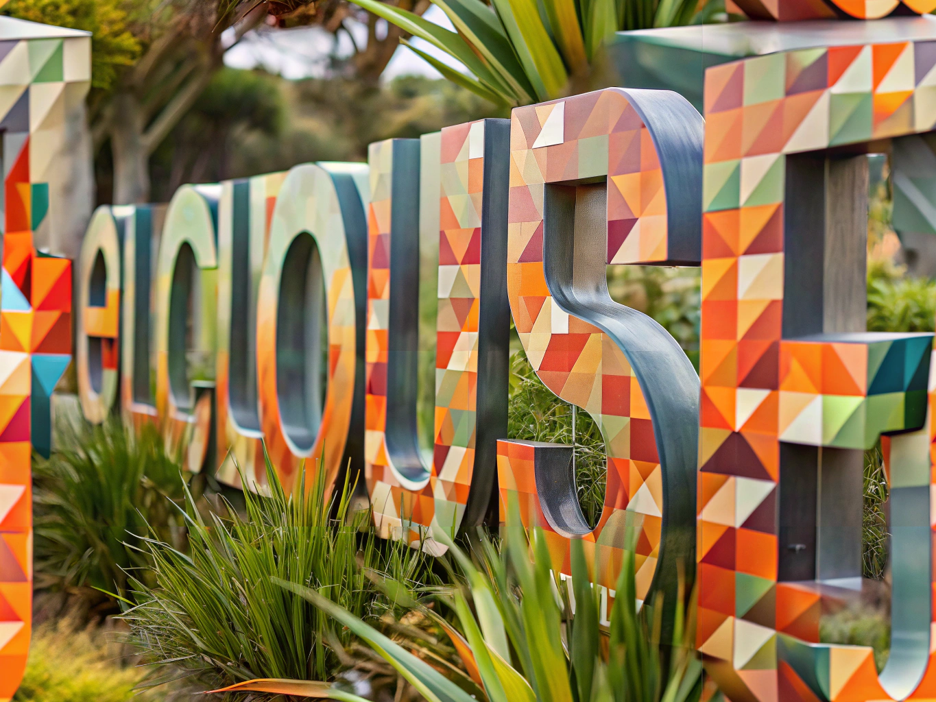
Crafting the Perfect Sign
Choosing the right font is just one piece of the puzzle in creating effective signage. Consider the context, audience, and message you wish to convey. The best fonts for sign readability are those that align with your design goals while ensuring clarity and impact. As you embark on your next design project, let these fonts guide you in crafting signs that speak volumes.
In the end, typography is more than just a design element—it’s a powerful tool for communication. By selecting the right font, you ensure that your message is not only seen but remembered. So, go ahead and experiment with these fonts, and watch as your signs transform into compelling visual narratives.
For more insights on effective signage, visit Michigan Custom Signs.


Leave A Comment