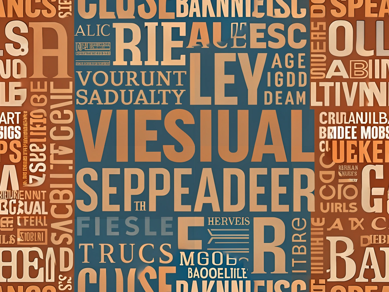
1. Helvetica: The Timeless Classic
When it comes to signage font styles, Helvetica stands as a beacon of clarity and simplicity. Its clean lines and balanced spacing make it one of the best fonts for advertising. Helvetica’s versatility ensures it looks stunning on both small and large outdoor signs, making it a favorite among designers who prioritize readability.
2. Futura: The Modern Minimalist
Futura is the epitome of modern design, with its geometric shapes and sleek appearance. This font is not only stylish but also one of the most easy-to-read fonts for signs. Its bold and clear characters make it perfect for outdoor signs that need to grab attention from afar. Futura’s contemporary vibe adds a touch of sophistication to any advertising campaign.
3. Arial: The Reliable Workhorse
Arial is often considered the go-to font for many designers, and for good reason. Its straightforward design and excellent legibility make it a staple in signage font styles. Arial’s adaptability means it can be used across various advertising mediums, ensuring your message is always clear and concise.
4. Verdana: The Digital Darling
Originally designed for digital screens, Verdana has made its mark in the world of outdoor signs. Its wide letter spacing and large x-height contribute to its status as one of the best fonts for advertising. Verdana’s readability is unmatched, making it an excellent choice for signs that need to be read quickly and easily.
5. Impact: The Bold Statement
True to its name, Impact is all about making a statement. This font is perfect for those who want their signs to stand out in a crowd. With its thick strokes and condensed letterforms, Impact is one of the most effective signage font styles for grabbing attention. It’s the ideal choice for bold headlines and short, impactful messages.
6. Gill Sans: The Elegant All-Rounder
Gill Sans brings a touch of elegance to the world of fonts for outdoor signs. Its humanist style and subtle curves make it both attractive and legible. Gill Sans is versatile enough to be used in a variety of advertising contexts, from sophisticated storefronts to eye-catching billboards.
Crafting Your Perfect Signage
Choosing the right font is an art form in itself. The best fonts for advertising are those that not only convey your message clearly but also resonate with your audience. Whether you opt for the timeless appeal of Helvetica or the bold impact of Impact, remember that readability is key. With these easy-to-read fonts for signs, your message will shine brightly, leaving a lasting impression on all who pass by.
In the ever-evolving landscape of advertising, the power of typography should never be underestimated. So, next time you’re designing a sign, let these fonts guide you to create something truly unforgettable.


Leave A Comment